HUE, VALUE and Costume
Last week the lesson left off after introducing the basics of color theory. Two more components, then we move into costume.
Hue
Hue is the term used to differentiate one color from another. Last week were presented primary, secondary, and tertiary colors. The position of a hue on the color wheel gives its characteristics and its relationship to every other color. Analogous colors are next to each other on the color wheel, ant color opposite to another on the color wheel is known as a complementary color. Black and white have no hue, they are known as neutral or achromatic colors. When mixed together, they form a range of greys. The values of the grey scale can be endless, but are often limited to about 9 colors.
Value
Value describes whether a color is bright, dull or dark. This can also be described as the lightness or darkenss of a color.
They can also be described as a value greyscale, as shown above.
Mixing Color/Tones
Tones are formed by mixing a hue with black and white in any proportion. A tint is any hue mixed with white, a shade is any hue mixed with black.
Fun With Color
Fun With Color - a quiz
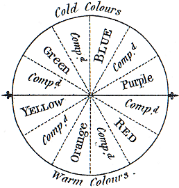 The first warm/cool color diagram
from Hayter, 1813 (sky blue is placed at top, because it was defined as the "purest" or most fundamental color
The first warm/cool color diagram
from Hayter, 1813 (sky blue is placed at top, because it was defined as the "purest" or most fundamental color
warm vs. cool colors in the color circle
There are two visual effects commonly attributed to any warm/cool color contrast. The first is that warm colors "advance" or attract attention in an image, while cool colors "recede" or seem to melt into the background. The second is that warm colors are active, arousing or cheerful, while cool colors are passive, restful or somber.
As with any other complementary color contrast, however, luminosity or saturation can influence these visual effects. A saturated orange is lighter valued and has a higher chroma than a saturated blue. When blue is matched with orange on chroma and value, the orange will appear quite brown -- hardly "attention getting" or "cheerful"!
Even so, many artists find it is effective to use cool colors as background for warm colors. Like the setting for a jewel, they provide an enhancing contrast. The warm colors capture our attention and seem to stand out from the cool background, in the same way light stands out in darkness.
The difference between warm and cool colors is so easy to perceive that you can often tell if one color is warmer or cooler than another even when the colors are so unsaturated that you cannot be certain of their hues. When mixing unsaturated colors, always decide first whether your mixture is warmer or cooler than the desired color, as this largely determines the direction in which the mixture should be adjusted, and makes it easier to choose the right paints to add
illumination